Tuesday 23 June 2015

Final Design, Concept & Storyboard

Overall I am very happy with my augmented reality advert concept. It is a perfect example of how unexpected interactive advertising can trigger the joy reflex and brighten someones day. Commuting can be repetitive, stressful and boring. Bus stops like the ones in Dunstable have no advertising at all which doesn't help. This augmented reality advert will effect lot's of people as it is in a busy area surrounded by shops, bars and the college. 

The use of a game will entice more people to get involved and better the commuters experience making it more memorable as they have actually taken part. The competing and rush will stir up more excitement for the player and surrounding viewers. This was inspired by the Cadbury augmented campaign that also featured a little game to encourage more interaction. I noticed that the excitement lasted longer than the Pepsi advert where once you had seen the advert it wore off. The game meant people could interact as a viewer and as a player and people were interested for longer as it's not a scripted ad that simply repeats.

 I have incorporated words and images that have a strong relationship. This is largely influenced by Roy Lichtenstein's work that features onomatopoeia. It adds a visual-linguistic element as well as a visual-spatial element, so there are two ways of receiving the same information. It also adds to the excitement as the words will suddenly appear and explode out, in sync with the sound effects. The typeface itself was inspired by my 'Words and Image in Advertising' post and how the type relates to the product or brand. I could either make a font made out of cookies (relating to the product) much like the Creme egg poster was written in creme egg. Or I could use a type that relates to the brand, much like how the Direct Line advert was written using one continuous line. I chose to do the latter as the cookie font seemed a bit over the top and was impractical. I chose a handwritten front that was bold yet condensed so it was eye catching and legible but didn't take up much room. I feel it matches the welcoming/home made/family experience that Millie's Cookies delivers.

The colours used match the branding of Millie's Cookies. This strengthens the identity and raises awareness. I chose to use the pink and blue from their branding striped pattern as they are the two dominant colours.


How it works

View from inside the bus stop looking down the street through the side panel.

Side Panel and the interactive section.

The interactive section augmented view.

Left arrow turns to a blue outline when pressed.

Character then moves left.

Right arrow turns to a blue outline when pressed.

Character then moves right.


Words and Image & 4D

Onomatopoeia will be featured in the game like seen below. The words will suddenly appear in sync with the movement it is representing. For example the 'bang' will appear when the cookie smashes off the ground. The colours used will be the same blue and pink to keep it consistent. Also in sync with the type will be sound effects. Windy sounds will play on a speaker when the cookie 'whooshes' past and explosive sounds when the cookie 'bangs'. This is influenced by the Pepsi advert which had good sound effects that improved the quality and effectiveness of the experience and also gained attention. Other type that will be featured is 'Near Miss' which will flash at the bottom of the screen when you narrowly avoid getting hit by a cookie. This adds to the excitement and pressure.


Storyboard

View from inside the bus stop showing the first stage of the advert. 'Tap to play' flashes while the decorative chunks circle clockwise.

Once the screen is tapped the instructions for the game appear. You then click 'Play' and proceed to the game.


The view switches to augmented reality and the game in the interactive section of the screen begins. Cookies fly at you from the sky and the player must use the arrows to control the character out of the way. Sound effects play when cookies crash and smash and fly past.


If you win, a coupon is printed out than you can redeem at any Millie's Cookies outlet. A map shows directions to the stand that is located round the corner..

If you lose, you receive no coupon.


Development

Scale
I chose to develop the game idea that featured a character at the bottom of the screen who you must control to avoid the cookie obstacles. There were two options I could take. One, shown on the top half of this layout page, is a small character at the bottom of the screen. The other, shown on the bottom half of the layout, is a larger life size character.  I couldn't have a full life size character on the screen as it would block most of the view down the street. So I cropped the person showing only the top half, so it is like a third person view.

After thinking about the logistics of someone playing this augmented game I had to change these ideas slightly. I realised that the player will have to be in reaching distance of the bus stop panel in order to play, meaning they will be stood very close. At this distance the character would be at the bottom of the screen by their feet meaning they would have to look down. However the cookies are flying at you from the top of the screen, making the game impossible to play as you cant look at the distance as well as the character unless you are stood further back. (See photos below showing the views)

 View looking at the top of the screen which would show the cookies approaching from the sky.

 View looking at the bottom of the screen which would show the character.


For this game to work the character would have to be higher up the screen so you can see the character and the cookies in the distance in front of it. I then decided to only have the middle section of the screen used for the game. This means when you are stood close to the screen you can still see the full view of the street and the area you have to look at directly in front of you on the screen is in the same field of view.


As the game was now only featured on the middle section of the screen the second option (a larger character) seemed more suitable. This meant the game is more realistic as the size of the character matches the size of a real person stood just in front of you. The fact that only the top half of the character can be seen makes it more realistic as this is what would be in your field of view looking forward.


Audience
I took into consideration the audiences that might play my game. Due to the location, the bus top attracts college students, families, and elderly shoppers. I had to design a game that is simple enough for all ages. There was a risk that a complex game might be great for students and young children with their parents, but too difficult for the elderly who are often less experienced with interactive technology. In order to not exclude anyone, I simplified my game. Originally I had planned 5 columns for the character to move horizontally across and actions like 'jump' and 'duck'. However too many controls and options would make it harder. I then simplified it to just three columns so the character can move to the left or right of its starting position. The basics of pressing the left arrow to move left and right arrow to move right can be accomplished by all ages. To make it easier for people that are different heights I made a strip down each side. This means that if you press anywhere along this strip it has the same effect as pressing the arrow itself. This means smaller children who might not be able to reach the arrows can still play. I gave these strips and the character a gradient from colour to transparent so they don't obstruct too much of the reality view. I also lowered the opacity so they can be seen but don't distract you from the reality view. 

Colour
I chose to use colours that are featured on Millie's Cookies branding. This strengthens the identity of the brand and makes it recognisable. The pink and blue can be seen on the stripy pattern that is used for their packaging, signage and interior design.

Words
I looked at fonts that relate to the imagery of cookies, inspired by my 'Words and Image in Advertising' post. I found some fonts that link to the shape and texture of cookies for example chunky fonts with bite marks and crumbly texture. I also looked at hand written sketchy fonts that relate to the home made theme of the brand. Overall, I didn't like a lot of the cookie related fonts as they were too bold, a bit over the top, or made people think of other treats like doughnuts etc. I wanted to include onomatopoeia in my game, inspired by my Roy Lichtenstein research. For example 'BANG!' when a cookie smashes and 'WHOOSH!' when one flies past. This meant the font I used had to be bold enough to stand out but not too chunky and wide that it takes up loads of room. The first font would be too wide whereas the hand written fonts were a bit more condensed.

After looking at more hand written 3D fonts that were still condensed I found Barlow by Thunderpanda ver 02. It is all uppercase, very legible, and bold yet condensed. 


Bus Stop

As a student at Central Bedfordshire College I could see first hand what Bus Stops were busiest and most suitable. First I looked at a stop between the college and The Store but realised it is not used frequently and often only for coaches of school children using the leisure centre. I then looked at a bus stop outside the college where many students get off the bus including myself. This stop had a great view up the street which wouldn't restrict my augmented reality but was very quiet. As the college car park has now moved, less students seem to use this stop. I then looked at the bus stops opposite The Store outside Asda. This was noticeably the busiest bus stop. It has its own bus lane, two bus shelters, and electronic bus timetables. This stop has the best transport links and is used by many students as well as the public, especially Asda shoppers. I chose to design for the left bus stop outside Asda as it has a better view of the street. The location and popularity of this bus stop makes it the perfect place to have my augmented reality advert.
Chosen Bus Stop (Left Shelter)

Busway Links to/from this stop. 
The Asda stop is located just below the Dunstable heading and is visited by three out of the 4 busway routes. It also used by many other Arriva, Centrebus and Grant Palmer buses such as the 24 and 31.


 Bus Stop between the college and The Store:
As you can see it is very quiet and there is barely a view down the street, just 20m of tarmac then the side of The Store building.


 Bus Stop outside the college opposite the old car park entrance: 
As you can see there is a good view down the street but it is empty.


Millie's Cookies

Millie's Cookies is a UK chain of retail bakeries that specialise in cookies but also sell cakes and hot drinks etc.


"Since we first opened in 1985, we’ve been baking fresh cookies all day every day. Today we have over 108 stores nationwide and we’re proud to offer you not only freshly prepared cookies, but also muffins, cakes, ice-creams, smoothies and shakes, hot choc, tea and coffee.

All real heart-warming, generous and delicious treats, made with Millie’s ‘know how’ using only premium natural flavours in all our products, no hydrogenated fats, artificial sweeteners or additives!"


https://www.milliescookies.com/about-us/


Millie's Cookies comes across as a very personal brand that delivers an experience. The colours and branding represent the family origins and welcoming ambience. For example the colours used are soft and light which is gentle and easy on the eye. The colours themselves such as pinks, blues and purples relate to the predominantly female audience. The typeface used in all of their current branding is hand written and looks sketchy along with the hatching. This reinforces the hand made theme that comes with Millie's Cookies.


"BRAND IDENTITY & PACKAGING
Millie's asked The One Off to create a new identity including; logotype, colour palette, typeface, brand language and iconography to complement a new store design. The new logo has personality with a handcrafted, yet lively feel."

http://www.theoneoff.com/work/browse/project/brandandidentity


"Millies Cookies

The brief
Millies Cookies were struggling to communicate the freshly baked goodness of their products. We were tasked with creating a brand new positioning that would give Millie’s a competitive edge within a fast developing baking category.

The solution
The first step was to establish the brand proposition through a series of strategic workshops with key stakeholders.
As part of this exercise we analysed the key attributes of the brand, their core values and personality to extract the ‘brand essence’.

Whilst ‘freshly baked’ cookies are central to Millie’s product proposition, it is Millie’s warm, welcoming fun and playful character that serves to set Millie’s Cookies apart from the competition. The new visual identity conveys Millie’s brand values and Millie’s personality through playful hand drawn typography. A soft colour palette was chosen to reflect naturalness and give the brand a contemporary feel.

The tone of voice used across the new identity echoes the informal, personal, chatty character of the brand. Photography plays an important role across the POS to achieve the brand’s desired position. It is used to show the quality of Millie’s products to the consumer, there is an emphasis on real ingredients to support the ‘freshly baked’ positioning. We extended the brand personality further through a number of seasonal campaigns.

We delivered
Brand identity, a variety of POS & menu-boards throughout stores, packaging design & seasonal campaigns.

Result
A change in consumer perceptions resulted in a significant sales uplift and increased retail footprint."

http://www.r-design.co.uk/project/millies2


http://www.theoneoff.com/work/browse/project/brand_guideline_millies
http://www.theoneoff.com/work/browse/project/brandandidentity
http://www.theoneoff.com/work/browse/project/millie_retail_interiors/sector/food
http://www.r-design.co.uk/project/millies2

Friday 19 June 2015

Theme

Here are some existing games that relate to my game idea. They all feature things coming towards you. In most of these, like Temple Run, SubwaySurfers, Ninja Kid Run, Crazy Taxi, Moto Racer Traffic, the background itself is coming towards you, to give the impression that the character is moving forward. This is like a treadmill machine where the person moves forward while staying in the same place. As my advert is showing the reality view, it cannot move towards the viewer. Instead the obstacles(cookies) will have to move towards the viewer while the background stays the same.


Friday 12 June 2015

Ideas


This was an initial idea mind map before we confirmed the use of augmented reality.

This was an initial idea showing a screen at the side of the bus stop with an interactive quiz game on it. The different genres meant the game would be enjoyed by all ages. However this did not involve augmented reality.

This shows the screen positioning at the side of the bus stop and the two approaches I could take. The top story board involves cookies as part of the augmented reality, directly relating to the brand Millies Cookies. The bottom storyboard features unrelated things like spaceships and animals, similar to the Pepsi Augmented Reality advert. I much prefer the top approach, as the brand is in the forefront of the advert and therefore will be remembered whereas the unrelated approach may only be remembered for the random things rather than the brand.

 I wanted to involve a game as the competing side could entice more people to take part and will spark excitement and trigger the joy reflex. Also, if there is something to win, more people are likely to get involved. The first game idea shows cookies falling from the reality view. The commuter then has to drag the basket across the screen or control the basket using arrows, to catch as many cookies as they can. The second game shows goals on the reality view in the form of loops. You then have to use the touch screen to flick cookies into these goals. The third game shows a character at the bottom of the screen who you have to control to avoid all the obstacles that approach you on the screen. The screen will show massive cookies etc rolling down the street at you. The fourth game also has a character who you control. You send the person up the street to collect floating coins but then the augmented view shows the street be victim to an earthquake. The fifth game will show augmented people on the street who you have to shoot with a cookie gun. Overall I felt the third idea was most exciting and it received the best feedback from the class. The things constantly flying at you from down the street provide a tense, exciting experience from start to end which is why it was most favoured. This is the idea I then chose to develop.

These are some things I could include in my advert. The use of sound, smell, 4D, voice recognition and motion sensors could improve the effectiveness of the advert and enhance the overall experience. However somethings are probably unnecessary, and aren't relevant to the product. For example smoke is probably a bit over the top and doesn't really relate to the advert and smells would be more suited to something that has a distinct smell, like coffee or perfumes. I definitely think sound effects would benefit the advert though to make it more realistic and engaging. Motion sensor's would mean to control the character you have to step right to move them right and jump to make them jump etc. This could potentially work and would add a feel good factor and make people feel like they've earned their cookie. I will consider these things in the development.


Sunday 7 June 2015

Design Direction


I have decided to design specifically for bus stops in Dunstable. This is because this is where the college is and many of the students commute there on buses. Also the bus stops in Dunstable seem to be particularly boring and free of any advertising, meaning it's already an issue in the area that would benefit from AR advertising. Here is a bus stop right outside the college. It is so empty that it doesn't even have the bus timetable on show.


The brand I am going to advertise is Millies Cookies. I like the idea of participating in the interactive augmented reality advert in order to win the product, much like what Cadbury did at Waterloo Station. This will entice more people to get involved as there is something up for grabs. There are two paths I could take. I could actually involve cookie related things in the advert (like chocolate chips etc) or take the Pepsi approach and have random sci-fi things but brand the advert with Millies Cookies and hope they remember Millies Cookies not just the advert.

Words and Image in Advertising

Here are some examples of words and image used in advertising. All of these have a good relationship between the words and images. The words and images influence each other, combining to make an effective advert that promotes the product.


In this Cadbury Creme Egg advert the type relates directly to the product. It's hand written using the creme from the egg. Not only is it in this creme, but the typeface links to the texture of it. For example, rather than the font being Times New Roman style, which would have no relevance, it is rounded and different shapes and sizes. The weight varies, some bits thin and some bits wide with large blobs. This matches the thick smooth texture of the creme.


This advert is for a fridge so they have cleverly made it look like an actual fridge with a white background and lots of magnetic alphabet letters on it. Some of the letters are then arranged to give information on the actual product such as the model and price. The different colours, wonky layout, and spare letters scattered, depict exactly what is found on many fridges so is not only bright but also relevant.


This advert is one of many Direct Line adverts that feature the same imagery. The type is made out of one red line linking to the name and colour scheme of the company. This particular advert is about helping pets get healthy again and shows a photo of a street where cats roam. The cat is made out of the singe red line that continues across the advert to form the type that reads their slogan 'take the direct line'. The single red line matches the company name and slogan and incorporates whatever the advert is about, in this case pets.


This is an advert for Starbucks Coffee. The image shows a cup of hot coffee with steam coming out. The type relates perfectly to the imagery as it is in a thin, wispy, floaty font. This means it blends in with the illustrated steam that is also wispy and thin. This is much more creative and innovative than the type being written in a text box on a horizontal baseline in a default font.


This advert is part of Buxton's new Naturally Pumped Up campaign. The image shows a Buxton bottle with water 'pumping' out. The type that reads 'Naturally Pumped Up' is arranged so that it looks as if the letters have burst out the bottle with the water. For example the letters are uneven with different angled baselines and are bevelled and tilted in different directions.


This advert for Puma features an illustrated trainer. The lace exits the trainer and forms calligraphic type. This was part of a series designed by Alex Trochut, where each design had a different trainer and city. All are based on the same theme where the lace exits the trainer and forms eye catching type. This is much more creative and striking, using the product advertised to make the type, than a text box with standard type.


Friday 5 June 2015

Words and Images Used In Work Of Others

Barbara Kruger
Barbara Kruger is an American Conceptual Artist born in 1945. Her jobs as a graphic designer, art director and picture editor, are evident in the work she is famously known for. She layers existing photographs (often black and white), with text (often white on red backgrounds). The text often addresses feminism, classicism, consumerism and sexuality.

"I work with pictures and words because they have the ability to determine who we are and who we aren’t."


This piece features a photograph of a hand that appears to be holding the type she layered on top. The text reads 'I shop therefore I am'. This derives from a French Philosopher
named Rene Descartes who's theory was 'I think therefore I am'. This means that as long as a person is simply thinking, they are living a meaningful existence. Barbara's twist 
approximately 400 years later is inspired by the consumer driven society we live in. She is saying that people feel they are living a meaningful existence by buying materialistic
things. This is also a criticism of the media who pressure people to define themselves by the things they buy and way they act. The font size of the type adds hierarchy and adds emphasis making it seem like a punchline. With 'therefore' written smaller, it acts like a connection or bridge between the type above and below it which share the same larger font size. This almost reads as 'I shop=I am'.This reinforces the meaning behind the statement whereby people think that because they are materialistic, they are valued. This message would not be as powerful if it were just the type. The monochrome photo provides contrast for the bright white type on a red box. This helps it stand out and draws more attention to the piece.The way the piece is arranged, with the red box fitting between the fingertips of the hand, makes it seem like a badge or label.This could be the meaning of the photograph as she is saying that once people buy these materialistic things, they have to advertise it and get recognition, other wise it was a waste of money.

This piece features a photograph of a woman's face, separated vertically. The left side is positive and the right side is negative, meaning the light and dark areas are reversed. This was originally a poster for a march in Washington in 1989 to support the rights of women and pro-choice in particular.The text reads 'Your body is a battlegorund'. This refers to the constant fight women take part in for power, and in this case the power to choose what happens with their own body. This design also shows Barbara's feminism in terms of woman's general place in society, and how she feels males should not be dominant. The photo shows half the face in negative, relating to light vs dark and good vs evil etc. The fact that its split right down the middle could suggest the power between men and women, and how she's striving for it to be equal. This could be reinforced by the type which is all 
centered, meaning the whole design is even and symmetrical. The type is split into 3 lines with large gaps between each. This reads slow and could suggest that females are tired of having decisions made for them or they've been fighting for so long. The female is gazing right at the viewer, as if directing this argument right at men. The same colours are used-white text highlighted in red, on a black and white photo-creating an eye catching design.


Rob Ryan
Rob Ryan is a British artist born in 1962 who is most famous for his paper cut outs. Although he considers himself a fine artist, his work adapts well to ceramics, textiles, homewares and jewellery. His cut outs often set a scene and feature text, and rarely have more than two colours, the cut out layer and a background.


This intricate cut out is beautifully made. It features imagery of a man on a ladder picking apples from his tree with the text 'Give me work to last me all my life'. Although little information, his cut outs really tell a story.The man featured in the cut out is wearing a hat and struggling to reach and pick the apple. This suggests he is old and the text is him appreciating his tree that has supported him his whole life. This adds to the reminiscing storytelling theme. The details throughout the picture and flowery imagery add to this positive vibe.The text itself relates directly to the imagery, as an apple tree will outlast a humans lifetime whilst providing fruit.The type is subtle enough to blend in with the branches of the tree but still easy to read. It isn't the main focus but is part of the whole design.


This is another beautifully intricate cut out. The design features a couple kissing inside a heart with the text 'We had nothing, we had not much, we had enough, we had everything. P.s. Please don't ever let me have too much.' The design is covered and surrounded by decorative imagery, with birds, flowers and leaves. Once again, it has a positive vibe and tells a story. The couple are placed in the centre of the whole piece, inside a heart. This is where your eyes are initially drawn. They are holding hands and kissing and feeling on top of the world (cloud imagery). The surrounding birds add to the 'love' theme and you can imagine them chirping. The detailed branches and flowers provide great camouflage for the type again, making it part of the whole design rather than a main focus. The text itself also relates directly to the imagery again. For example it is saying that even when the couple had nothing (in terms of money, shelter, food, job maybe), they had each other and that was all that mattered, so felt like they had everything. It then says 'please don't ever let me have too much' as that might mean they lose each other. There is also some subtle imagery amongst the detail, such as keys, implying they have the keys to each others hearts.


Roy Lichtenstein
Roy Lichtenstein was an American Pop Artist born in 1923. Many of his works are influenced and inspired by comic strip art, and this is evident in some of his most famous works that were made in the 60's.


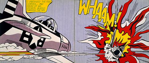
This piece, called 'Whaam!', features 2 panels, much like a comic book strip. The left panel shows a fighter plane firing rockets which then hit another plane in the right hand panel exploding it in flames. The speech bubble on the left reads 'I pressed the fire control...and ahead of me rockets blazed through the sky', describing the action taking place in that panel. It is in a small font size, single font colour, and in a small speech bubble in order to be legible but not take any attention away from the comic. In the right panel the tile 'Whaam!' is written as if exploding out the burning plane. It is in large, bold, uppercase type with a thick outline to make it stand out. This is onomatopoeia for the sound of the rocket hitting the plane. This is the stand out bit of the design, and the colours in general are brighter on this side making it more eye catching. Overall this looks as if it could have been cut out from an actual comic strip. On the left panel the imagery is the main focus then on the right panel the type is the main focus.

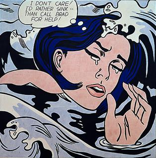
This piece is called 'Drowning Girl'. It features a girl drowning with the thought bubble reading 'I don't care/ I'd rather sink..than call Brad for help!'. The frame is very close up, with the head and hand taking up a large amount of the design. It is almost like a cropped section of a larger scene. As we don't know the rest of the scene or have any other panels of comic strip, we' don't know the background story or any information. This leads to different interpretations of the design. Some say that she is in fact drowning in her own tears while others say her head is resting on the wave like a pillow and she is positioned like she is laying in bed. Some people therefore think there is a blend of eroticism and final resting place. The art itself features his thick black outlines and dot technique with comic style text in the foreground. Despite the thought bubble being small (to allow room for imagery suggesting the image is the main focus), and featuring plain legible type, the fact that is is always in the foreground gives it a balanced focus with the imagery itself.


Imants Tillers
Imants Tiller is an Australian Visual Artist born in 1950. Many of his works are made up of small canvases, to make transportation of the large painting easier. He takes inspiration from aboriginal art, often paying homage to someone in his work, and layers this with poems or pieces of text.


This piece, called Namatjira, is a homage to Albert Namatjira who was a pivotal figure in Australian art. Albert used to paint Australian landscapes, much like this one, but using water colours. Imants has used acrylic and gouache paint here and added text from 'On the mountain' by an Austrian writer named Thomas Bernhard. The content therefore relates to the painting. The painting of the landscape is in the background here with the type over top. However the type is quite pale and in some places a similar shade to the background its on, meaning it doesn't stand out from the painting. Although it can still be easily read, it is not the main focus of the piece. The rest of the painting has aboriginal inspired writing/art over top. This combined with the text makes a sort of translucent layer over the landscape background. The two layers together tell a story and when you actually read the text it gives an insight into the meaning behind the piece and the artists mindset or vision.


This piece is called 'Once upon a time' and features a landscape in Monaro, Australia. The painting shows two volcanic hills which are the most significant feature in these plains. Over top of this are words and cut up text inspired by Rosalie Gascoigne who did the same with letters in much of her work and even had a piece on this same region. Layered over this fragmented text are complete words , all of which are towns and farms in Monaro. In the top left there is a quote from Alfred Lord Tennyson's poem 'To Virgil' which pays homage to the classical poet Virgil. Both wrote lyrical poetry on country and landscape. All the type featured on this piece therefore has relevance to the landscape painted. Similar to 'Namatjira', the landscape is in the background with type layered over top. The type is pale again and doesn't completely contrast with the background meaning it can be read but isn't the main focus. On this piece there is one piece of imagery layered on top of the type. This is the crucifix on the left, representing where a windmill would be placed (this piece was commissioned in response to plans of a 127 turbine wind farm in the region). The crucifix is in a thick white paint and is slightly brighter than any other white on the painting, especially standing out against the darker background its on. This is a subtle but clear and direct protest.


Overall, these artists all use the combination of word and image for different purposes and to different effectBarbara Kruger uses bold Futura type highlighted in red, on a monochrome background. The words are brief and straight to the point. She is protesting. All this is powerful and eye catching. Her aim is to ask important political questions and make you think. Rob Ryan on the other hand combines words and image so they are one. The imagery and type blend together seamlessly. The work tells a positive story and has a feel good vibe. There is no focus but endless detail if you take the time to look closely. Roy Lichtenstein's work is a medium between the two. His work is inspired by comic book strips where the imagery and words swap hierarchy. Some feature large bold onomatopoeia which stands out, and some feature small speech bubbles which describe the more important illustrated scene. Imants Tiller's work is similar to Rob Ryan's. For example the image and type blend together and share importance, with the type adding relevance and meaning to the imagery. Imants now even regards his works to be as much word poems as paintings.