Barbara Kruger is an American Conceptual Artist born in 1945. Her jobs as a graphic designer, art director and picture editor, are evident in the work she is famously known for. She layers existing photographs (often black and white), with text (often white on red backgrounds). The text often addresses feminism, classicism, consumerism and sexuality.
"I work with pictures and words because they have the ability to determine who we are and who we aren’t."
This piece features a photograph of a hand that appears to be holding the type she layered on top. The text reads 'I shop therefore I am'. This derives from a French Philosopher
named Rene Descartes who's theory was 'I think therefore I am'. This means that as long as a person is simply thinking, they are living a meaningful existence. Barbara's twist
approximately 400 years later is inspired by the consumer driven society we live in. She is saying that people feel they are living a meaningful existence by buying materialistic
things. This is also a criticism of the media who pressure people to define themselves by the things they buy and way they act. The font size of the type adds hierarchy and adds emphasis making it seem like a punchline. With 'therefore' written smaller, it acts like a connection or bridge between the type above and below it which share the same larger font size. This almost reads as 'I shop=I am'.This reinforces the meaning behind the statement whereby people think that because they are materialistic, they are valued. This message would not be as powerful if it were just the type. The monochrome photo provides contrast for the bright white type on a red box. This helps it stand out and draws more attention to the piece.The way the piece is arranged, with the red box fitting between the fingertips of the hand, makes it seem like a badge or label.This could be the meaning of the photograph as she is saying that once people buy these materialistic things, they have to advertise it and get recognition, other wise it was a waste of money.
centered, meaning the whole design is even and symmetrical. The type is split into 3 lines with large gaps between each. This reads slow and could suggest that females are tired of having decisions made for them or they've been fighting for so long. The female is gazing right at the viewer, as if directing this argument right at men. The same colours are used-white text highlighted in red, on a black and white photo-creating an eye catching design.
Rob Ryan
Rob Ryan is a British artist born in 1962 who is most famous for his paper cut outs. Although he considers himself a fine artist, his work adapts well to ceramics, textiles, homewares and jewellery. His cut outs often set a scene and feature text, and rarely have more than two colours, the cut out layer and a background.
This intricate cut out is beautifully made. It features imagery of a man on a ladder picking apples from his tree with the text 'Give me work to last me all my life'. Although little information, his cut outs really tell a story.The man featured in the cut out is wearing a hat and struggling to reach and pick the apple. This suggests he is old and the text is him appreciating his tree that has supported him his whole life. This adds to the reminiscing storytelling theme. The details throughout the picture and flowery imagery add to this positive vibe.The text itself relates directly to the imagery, as an apple tree will outlast a humans lifetime whilst providing fruit.The type is subtle enough to blend in with the branches of the tree but still easy to read. It isn't the main focus but is part of the whole design.
This is another beautifully intricate cut out. The design features a couple kissing inside a heart with the text 'We had nothing, we had not much, we had enough, we had everything. P.s. Please don't ever let me have too much.' The design is covered and surrounded by decorative imagery, with birds, flowers and leaves. Once again, it has a positive vibe and tells a story. The couple are placed in the centre of the whole piece, inside a heart. This is where your eyes are initially drawn. They are holding hands and kissing and feeling on top of the world (cloud imagery). The surrounding birds add to the 'love' theme and you can imagine them chirping. The detailed branches and flowers provide great camouflage for the type again, making it part of the whole design rather than a main focus. The text itself also relates directly to the imagery again. For example it is saying that even when the couple had nothing (in terms of money, shelter, food, job maybe), they had each other and that was all that mattered, so felt like they had everything. It then says 'please don't ever let me have too much' as that might mean they lose each other. There is also some subtle imagery amongst the detail, such as keys, implying they have the keys to each others hearts.
Roy Lichtenstein
Roy Lichtenstein was an American Pop Artist born in 1923. Many of his works are influenced and inspired by comic strip art, and this is evident in some of his most famous works that were made in the 60's.
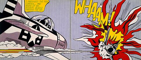
This piece, called 'Whaam!', features 2 panels, much like a comic book strip. The left panel shows a fighter plane firing rockets which then hit another plane in the right hand panel exploding it in flames. The speech bubble on the left reads 'I pressed the fire control...and ahead of me rockets blazed through the sky', describing the action taking place in that panel. It is in a small font size, single font colour, and in a small speech bubble in order to be legible but not take any attention away from the comic. In the right panel the tile 'Whaam!' is written as if exploding out the burning plane. It is in large, bold, uppercase type with a thick outline to make it stand out. This is onomatopoeia for the sound of the rocket hitting the plane. This is the stand out bit of the design, and the colours in general are brighter on this side making it more eye catching. Overall this looks as if it could have been cut out from an actual comic strip. On the left panel the imagery is the main focus then on the right panel the type is the main focus.
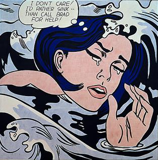
This piece is called 'Drowning Girl'. It features a girl drowning with the thought bubble reading 'I don't care/ I'd rather sink..than call Brad for help!'. The frame is very close up, with the head and hand taking up a large amount of the design. It is almost like a cropped section of a larger scene. As we don't know the rest of the scene or have any other panels of comic strip, we' don't know the background story or any information. This leads to different interpretations of the design. Some say that she is in fact drowning in her own tears while others say her head is resting on the wave like a pillow and she is positioned like she is laying in bed. Some people therefore think there is a blend of eroticism and final resting place. The art itself features his thick black outlines and dot technique with comic style text in the foreground. Despite the thought bubble being small (to allow room for imagery suggesting the image is the main focus), and featuring plain legible type, the fact that is is always in the foreground gives it a balanced focus with the imagery itself.
Imants Tillers
Imants Tiller is an Australian Visual Artist born in 1950. Many of his works are made up of small canvases, to make transportation of the large painting easier. He takes inspiration from aboriginal art, often paying homage to someone in his work, and layers this with poems or pieces of text.
This piece, called Namatjira, is a homage to Albert Namatjira who was a pivotal figure in Australian art. Albert used to paint Australian landscapes, much like this one, but using water colours. Imants has used acrylic and gouache paint here and added text from 'On the mountain' by an Austrian writer named Thomas Bernhard. The content therefore relates to the painting. The painting of the landscape is in the background here with the type over top. However the type is quite pale and in some places a similar shade to the background its on, meaning it doesn't stand out from the painting. Although it can still be easily read, it is not the main focus of the piece. The rest of the painting has aboriginal inspired writing/art over top. This combined with the text makes a sort of translucent layer over the landscape background. The two layers together tell a story and when you actually read the text it gives an insight into the meaning behind the piece and the artists mindset or vision.
This piece is called 'Once upon a time' and features a landscape in Monaro, Australia. The painting shows two volcanic hills which are the most significant feature in these plains. Over top of this are words and cut up text inspired by Rosalie Gascoigne who did the same with letters in much of her work and even had a piece on this same region. Layered over this fragmented text are complete words , all of which are towns and farms in Monaro. In the top left there is a quote from Alfred Lord Tennyson's poem 'To Virgil' which pays homage to the classical poet Virgil. Both wrote lyrical poetry on country and landscape. All the type featured on this piece therefore has relevance to the landscape painted. Similar to 'Namatjira', the landscape is in the background with type layered over top. The type is pale again and doesn't completely contrast with the background meaning it can be read but isn't the main focus. On this piece there is one piece of imagery layered on top of the type. This is the crucifix on the left, representing where a windmill would be placed (this piece was commissioned in response to plans of a 127 turbine wind farm in the region). The crucifix is in a thick white paint and is slightly brighter than any other white on the painting, especially standing out against the darker background its on. This is a subtle but clear and direct protest.


No comments:
Post a Comment